Scale of Maps and Charts
The scale of a chart represents the relationship between a distance on the chart and the actual distance on the Earth’s surface. It helps pilots measure distances and plan flight routes accurately. A large-scale chart shows more details but covers a smaller area. A small-scale chart covers a larger area with fewer details. Aviation charts use scales to support accurate navigation and flight planning.
Graduated Scale Line
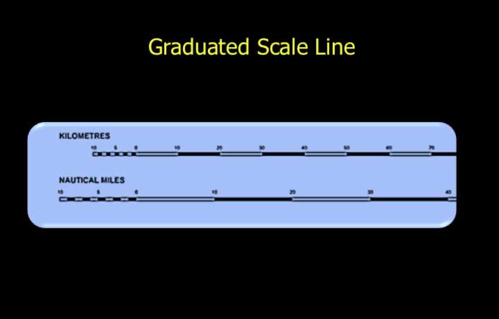
- Scale is the relationship between distances on a chart and distances on the ground.
- This relationship can be represented as a graduated scale line.
- A graduated scale line is a visual representation of scale marked on a line.
- It is useful for visual estimation of distances.
Statement in Words
- Scale is the relationship between distances on a chart and distances on the ground.
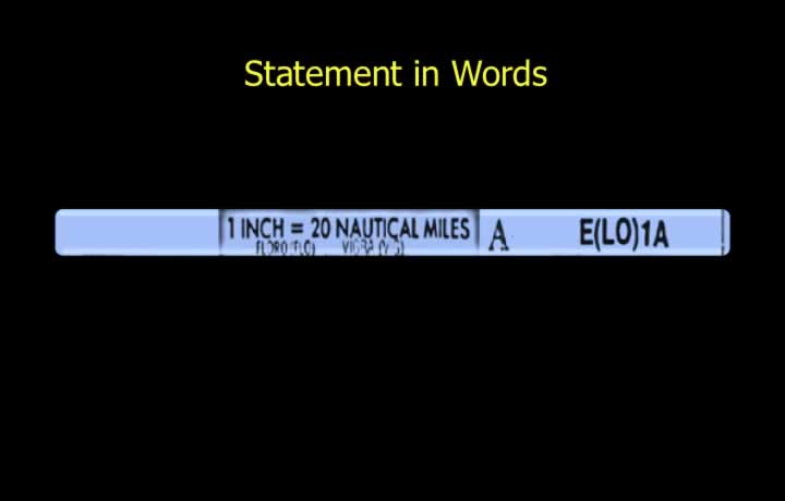
- The relationship can also be expressed as a written statement.
- A statement in words explains the scale in simple terms.
- Example: One inch equals twenty nautical miles.
- This method is useful when using a ruler or standard inch scale for measurement.
Representative Fraction
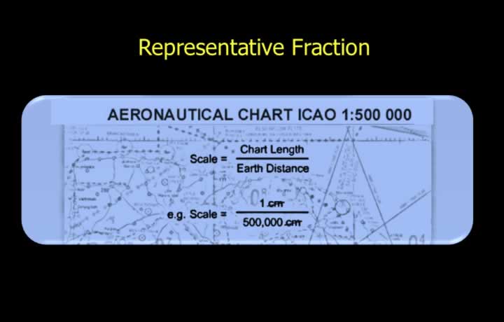
- Scale is the ratio between chart distance and ground distance.
- This can be expressed as a representative fraction (RF).
- RF is the ratio of chart length to actual ground distance.
- Both numerator and denominator must be in the same units.
- It is a unitless ratio.
Example of Representative Fraction
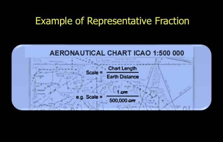
- Representative fraction example: 1 : 500,000
- This means 1 unit on the chart equals 500,000 units on the ground.
- For example, 1 inch on the chart equals 1 million inches on the ground.
- Similarly, 1 cm on the chart equals 1 million cm on the ground.
Large Scale Chart
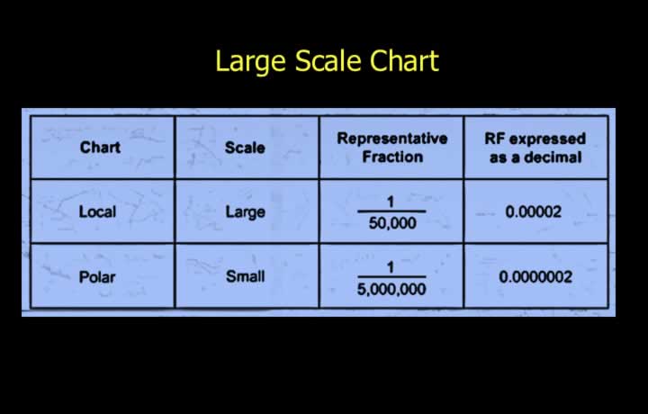
- Large scale charts provide more detail.
- They cover a smaller geographic area.
- Large scale charts have a larger representative fraction.
- This means a smaller denominator in the RF.
- Example: A 1:500,000 chart is larger scale than a 1:1,000,000 chart.
- Naming charts as “one million” or “half million” can be misleading in casual terms.
- Charts are usually compared by their denominator value.
Small Scale Chart
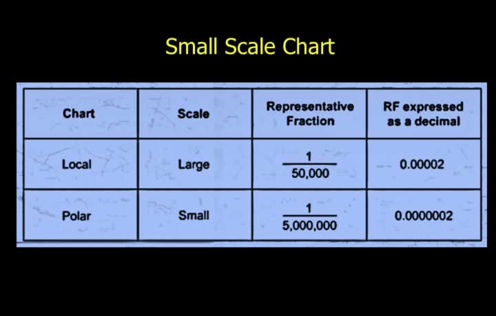
- Small scale charts provide less detail.
- They cover a larger geographic area.
- Small scale charts have a smaller representative fraction.
- This means a larger denominator in the RF.
- Example: A 1:1,000,000 chart is smaller scale than a 1:500,000 chart.
- Although names like “one million” or “half million” are used, comparison should be based on scale ratio.